

Compliance on Demand
A comprehensive solution designed to help clients quickly and easily research, understand and stay abreast of wage and hour compliance developments by way of a robust search, an online community, and accessing legal counsel.
Role
Lead Designer
UX Architecture
Activity
Conducted analysis, developed strategic solutions, and delivered final design
Worked with dev to ensure quality of execution and interactions
Impact
30% increase in engagement, year over year( vs. previous compliance portal)
Increased Client Trust and Retention
Elevated organizational presence in compliance space
Overview
Clients couldn’t find information, docs, or content they wanted
The previous tool was complicated, not only due to the a dense amount of content, but also because difficulty searching and browsing for content.
In addition to the two main entry points to browse and search, the accompanying content was random and haphazard, not having significant relevance to clients ( the toolkit option seldom resonated with goals of users )
The content structure was also confusing - resulting in frustration, inefficiency, and underuse of a valuable resource.
Overwhelming and disjointed information
No clear paths to find what’s most relevant
Low trust in search and categorization
From client feedback, they felt the legacy design had confusing entry points for search and browse.
Manuy attempts to find relevant content resulted in dead ends.
Other content surfaced on the page was generally not useful or relevant to users.
This entry design focused on Toolkits, a terminology that had no resonance with clients and caused a great deal of confusion.

The seconary entry point was to search forms and document. The results were often too numerous and not filtered on a specific state - the outcome that is most useful to clients.
Approach
The compliance portal needed a significant redesign - so we took the opportunity to start from zero.
Addressing client Issues
Surveys & Feedback
We started with an initial survey and continued gathering input through biweekly check-ins with the product council.
Key takeaways:
Clients wanted more personalization and a smoother search experience
They needed a simple way to set preferences
The existing content experience was frustrating—most resources were only available as PDF downloads, with no in-app viewing option
These client insights directly informed our design direction.
Simplified content architecture
I started by distilling the content into its most essential elements, then rebuilt the experience from the ground up.
Eliminate confusion
To create a product our clients could confidently use, we needed to address the disorganized structure of the existing content architecture.
After some analysis, I identified that all content types, and categorized them into nine clear buckets.

Finding the Right Search & Browse Pattern
Clients prefer searching but also want to browse different content types when needed.
The challenge was to make both search and browse intuitive starting points for users.
The Initial concept
Switching between search and browse confused users and received negative feedback.

The winner: separate search and browse sections - 100% task success in testing.
The approach really clicked with users
70% of research participants navigated the search and browse tasks quickly, and all completed them - calling the pattern easy to use and learn
After searching or browsing, user can manage content types and location.
Only show result relevant to Location
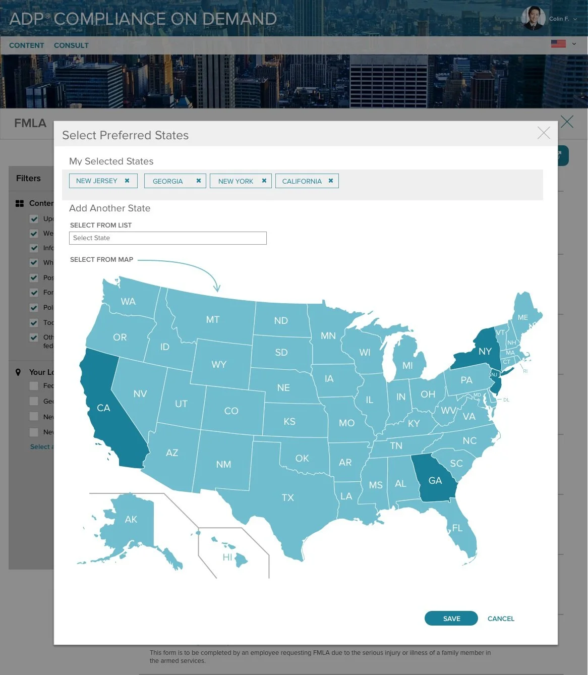
Users expect search results to reflect the regions and states pertinent to them. Their prefered states would filter results across any search.
Easily to filter Content types
Users need to search across various content types (e.g., Updates, Whitepaers, Policies, etc). Content types can be selected after initiating a search.

Personalized approach
Most clients only need complience information relevant to the states they do business
Clients only want to view information relevant to them:
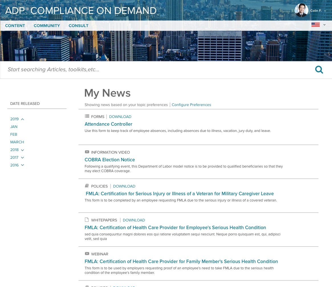
Articles in My News is based on client preferences.
State location can be selected and kept as a default
Client can manage their preferences an also select tags on from content pages.
Adding important content updates is easy via the content calendar.
My News (on the homepage and specific page)

Select preferred state
Final output
Scalable, Flexible Design for Easy Updates
We designed a simple, scalable framework to support future updates with minimal effort. Early wireframes addressed content and layout challenges, ensuring alignment with development for a smooth handoff. The result: a clean structure that's easy to maintain, modify, and build on.

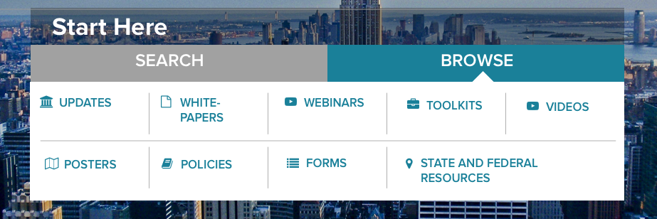
Easy entry points for Search and Browse.
Based on metrics and user testing clients two main goals are search and browse. Search rated higher as a goal - it’s showcased at the top of the page.
For browsing, we present detailed descriptions of the content types.
Easy to refine Search Results.
Users can refine searches easily by selecting content types or location.
Additional features allow clients to add favorites, schedule updates for specific issues, and link to related content for improved workflow efficiency.

Viewing Content.
Along with reviewing selected information, users can review related content.
Clients can customize their experience by selecting tags they are interesting in.
“The convenience of having one source that covers federal, state and local jurisdictions is a huge timesaver.”