

Network Detective. Responsive Redesign
UX/UI + Mobile + Responsive + Art Direction
Network Detective. Responsive Redesign
UX/UI + Mobile + Responsive + Art Direction
A new direction
Performance IT's product RapidFireTools was in need of an overhaul in several areas. The new product they offered no longer fit within the original brand promise of RapidFireTools.
They decided to rebrand the name to Network Detective - one of their best performing products within the brand. Along with this branding update, they also wanted a new website that would be responsive and adaptive for mobile devices.
Design Approach
I sat down with the team over Network Detective to fully understand how they wanted to restructure their product offering. I have been leading the design for this product for many years, this being version 3 of the website and branding, so I came in with a lot of historical knowledge.
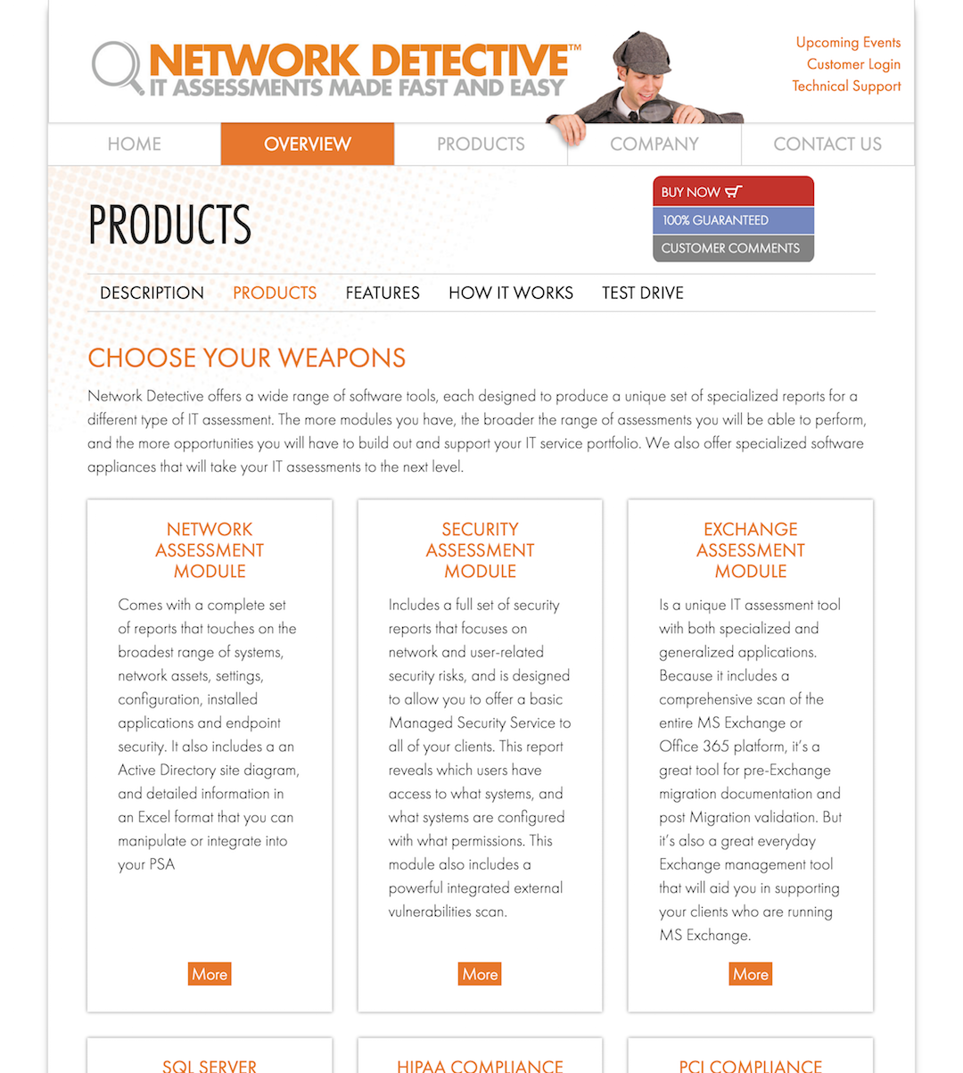
Their main concerns were creating an architecture and layout that allowed visitors to quickly navigate between the products, and a product menu that was modular, allowing them to add new products that would be available in the coming months.


navigation
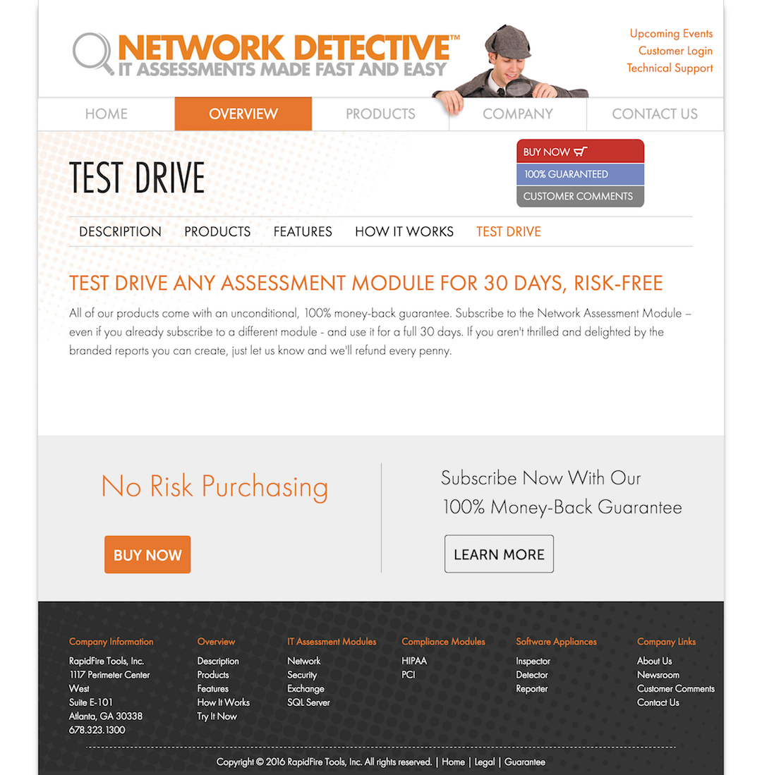
The overall navigation strategy is to allow visitors to quickly jump through sub topics, only needing to return to the top nav menu when going to a different section. With this in mind, I created a sub-menu pattern for each larger section.
For the products menu, I used a mega-menu approach, using a visual representation of the products to add interest and engagement. For navigating between products I added floating navigation tabs on the left and right of the page. When hovered over, the tabs, showing directional arrows, expand with the name of the adjacent product.
I created two main features to address the need to toggle between products and allow new products to be easily added.


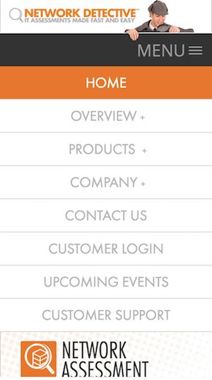
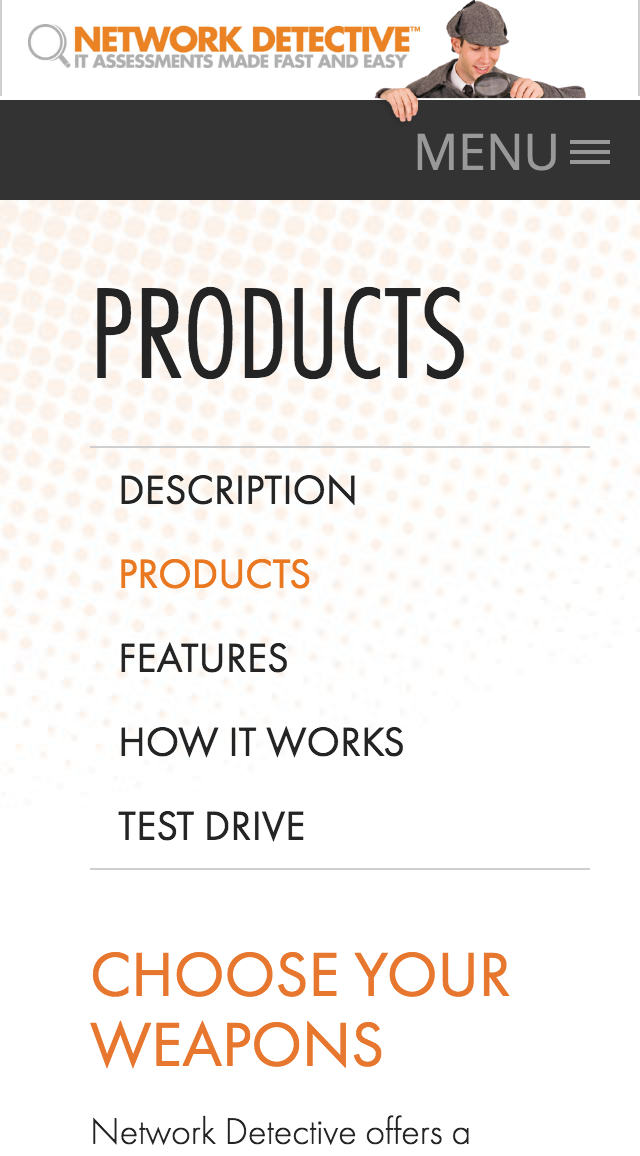
RESPONSIVE + MOBILE READY
One of my guiding beliefs about current design standards is that the majority of website will eventually be viewed mainly on a mobile devices.
Research show that people prefer to do more involved interactions, filling out forms, on a desktop. But mobile is often their first impression.
Based on this, I took a responsive/adaptive approach for this design. I designed the majority of the site to scale down to a mobile view, but for the most important areas, I created an adaptive mobile view so there was no loss of experience for a touch device.
I took this adaptive approach for the homepage, product pages, and order page. I re-designed the desktop experience into patterns optimized for a mobile screen as well as a touch interface.
In most cases this only involved updating the layout, but in others, such as the order page, I changed the full interaction pattern for selecting products and receiving feedback about their selections.


order PAGE challenges
The order page is one of the most important sections of the Network Detective website. Along with allowing customers to select the products they want, the page also helps educate them on batch discounts: Basically, the more you order the more you save. Along with that concept, I needed to also communicate they can also save by purchasing a yearly subscription vs. a monthly one.
The challenge of communicating batch savings is you want it to feel like you're educating not upselling. My approach to this was to show the pricing and the potential savings, while also showing any current savings. I did not want to highlight any specific deal as being "BEST DEAL" or any other marketing approach.
The other challenge was to clearly communicate what they were ordering and why it cost what it cost. Some of the products offered have additional features that can be added, and I had to devise a clear and concise pattern that user could understand.
The next step was creating a mobile version of the checkout. The patterns from the desktop view didn't scale very well into a smaller, vertically aligned layout. I created an adaptive pattern, different from desktop, but similar in how the user would interact with it.
CHECK OUT/ SHOPPING CART
A new feature that will be added is a checkout/shopping cart. Currently on the site, visitors look through the products and make their purchase decisions onthe order page. The checkout( or shopping cart ) will allow users to add products to a cart as they look through the product descriptions.
I designed the cart to allow a seamless experience. The goal is to allow users to add products and view their cart items without needing to navigate to a new page. I created a simple button they can invoke to add a product to their cart. And also a simple and straightforward way to go to the checkout.
The final destination of the cart is the order page. View the website.